 The much-hyped, AdHouse-published Mesmo Delivery by Rafael Grampa should be enough to blow any comic book reader away. The story's some good, hazy revisionist Western/70s action movie stuff--bad-ass trucker has to deliver a mysterious haul, accompanied by a just as mysterious Elvis impersonating navigator--and the art is like a chunk of pretty much every mind-blowing comic artists/stylist's work combined together, precariously balancing visionary art with done-his-homework homage.
Most reviews have found a place for a reference to the great Geoff Darrow and there's no doubt a lot of that in here; that outsider-art obsession with detail, tons of crazy, beautifully-rendered violence, a profound mix of the cute and cartoony and ugly reality, etc. But there's some Blueberry style Moebius (back before he was Moebius) all over it, and the controlled chaos of the work of some of Grampa's friends, like Vasilis Lolos (one character looks like the kids from Last Call; it's gotta be a fun reference), Becky Cloonan, and Gabriel Ba (the book's dedicated to Ba and his brother Fabio Moon).
Grampa's visual narrative is flawless, something that's all the more impressive because in big, cluttered-art action books like Mesmo, each image is often the focus over forward-moving storytelling. The first few pages bounce between wide "shots" of ugly roads, industry, and crappy gas stations, and intense close-ups and medium shots of the truck's interior as well as Rufo, the over-sized trucker and creepy, Elvis-y Sangreco.

Those interior panels feel cramped the way being stuck in a car for long drives do, and provide a new piece of information in every frame. You get more details of the truck or the setting and you slowly get a proper sense of Rufo's size, with each frame revealing a different piece of his body. It begins with his hat, moves to his sausage fingers, reveals his lower-half as he gets out of the truck, his broad shoulders as he enters the bar, and then finally, when you turn the page, a panel-less, image of Rufo from the front, hardly obscured.

Grampa brilliantly does all of this within conventional panels and framing, and builds atmosphere or immediacy through really innovative angles. Look at the image above, which is Rufo getting out of his truck--it's the first time we see his lower half--and it's not only a cool, sexy, angle--I think it was Cassavetes who quipped that the easiest way to make a nice "cinematic" shot was to stick something obstructive in the foreground--because it's so well-rendered, that you feel like you can hear the truck idling, and Rufo's boots crushing grains of dirt underneath them.
There are also these kind of match-cut panels, where Grampa will brilliantly transfer to a flashback through really cool visual cues. In a fight with a guy who it looks like he could take when the bet's made (only the find out, moments before the fight, the guy has an oversized hand to fight with...), Rufo recieved an upper-cut that sends him in the air and to the ground, knocked-out. Grampa inserts two panels that put Rufo in boxing clothes but in the same position, and then returns to Rufo's head hitting the ground, blood spurting from his nose. A few pages later, we'll learn that Rufo is a failed boxer and so, besides being a fun stylistic exercise, it's a brilliant way to hint at his past.

Another match-cut comes when the big-fisted dude that beat Rufo up, opens the back of the truck. In a wide-shot from inside the truck, we see the doors flung open and the guy shocked. Grampa cuts-off revealing what the guy sees and what'll happen to fly to a flashback of Rufo being hired to carry the mysterious cargo, the angular contours of a desk and office coming close to matching-up with the floor and sides of the truck.
Perhaps the most brilliant use of angle and in a way, the place where Grampa's innovation meets-up with his interaction with artists of the distant past, is the way he depicts a decapitation. Again, yeah, this is all super-awesome comic book violence, but the fact that Grampa goes one step further in a comic that's forever going one step further, right when the previously slug-like Sangreco finally acts gives it all some added power.
We're going back now, to the part where the big-fisted bar guy opens the back of the truck. Well, out comes Sangreco, wielding a knife, and he slowly chops-up every asshole bar patron. The kills--and this action sequence--are then punctuated by the decapitation of the from-a-Lolos-book character. Rather than explain it all and then show you, I'm going to do it panel by panel because what's going on really deserves it.
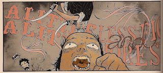
So here, the angle is low and we see in the background Sangreco, ready to chop on his way down.

The next shot is a sort of close-up of the Lolos guy screaming.

Then, we get an even closer shot and you see the inevitable slice of the knife going through the back of his head.

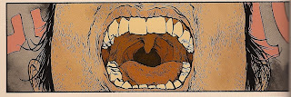
Now, the head is disconnected from the body, little pieces of flesh and muscle sag and sway in the direction of the knife slice. Notice how this shot is even closer as you can barely see the uvula of the man.

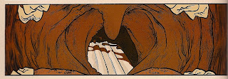
Here, we're again even closer and we see the aftermath, as a torrent of blood gushes from his neck.

And finally, we go to a different shot, with the man's head bouncing off the ground.

Yeah it's crazy and cool, but there's something really strange going on with the angles and panels here. Even though a lot of comic book artists themselves use the term "camera" when speaking of the presentation of their images, it has always seemed weird and problematic because visual narrative came before cinematic narrative and camera, in the "movie" sense should connote motion and comic books even at their most visceral are going to read like really precise, really kinetic photographs. But not here! Grampa's really doing camera-work.
It's as if he has a tiny, tiny camera on an invisible dolly because what happens is, in each successive frame, the camera moves further into the screaming Lolos guy's mouth but stops short of being struck by Sangreco's knife so that we clearly see the entrance and exit of the knife. And it's like, at the point where the knife enters, the camera's connected to the guy's head because it then kind of moves backwards with the head as if flies off. Does that make sense? Probably not. It's sort of the same effect as when in a Spike Lee movie a character will be walking and then suddenly, they are like, attached to the camera and it seems the camera--or really the dolly--is walking for them, only the camera becomes connected to the person.
And here are both pages as they appear in the comic:


In terms of comic book history, it's the cover of Hard Boiled that I've babbled on about here but taken even further. And so, it all goes back to Darrow. Not to imply Grampa's work is derivative--this is the problem with describing art, it's easy and pragmatic to compare it to other artists--but because he has the same feeling of fuck-all fun and insanity of yeah, Hard Boiled and Rusty & Big Guy but especially Darrow's solo book Shaolin Cowboy. Like Shaolin, Mesmo is a genre pastiche that does the um, pastiche-ing (?) so well that it just turns into something way more insane and crazy than the thing it started out trying to ape.
If anything, the prestige-like, near-trade quality of the book, to stylish but kinda "Hot Topic" cover design, and just the fact that AdHouse is putting it out, puts the book out of context. This is trashy, silly, fun, done with a ton of enthusiasm and expert precision. In that way, it again, goes back to weird 70s movies, the kinds that put enough violence or nudity in them to get drive-in showings, but usually had some other, heavy, smart stuff bubbling in the background.


5 comments:
whoa dude
yeah, anonymous said it, man . . . WHOOOAAAH!
seriously, though . . . great piece and what great looking images. in addition to all the great stylistic references you mentioned, his figures also have a sort of pope-ey-ness, particularly in in certain details like hair or the wrinkles on an article of clothing and even some of the faces (i'm thinking rufo in particular), the way pope and apparently grampa have this ability to make really precise lines look like scribbles dashed off while taking a shower--you know what i mean? also, the way he adds all of those little textural dashes to some of the faces reminds me of that one zombie series sammy is really into--you know the one from his t-shirt? the best part of it all is, as you say, the way he is able to reference all of these great styles in a recognizable way and combine them in such a fashion as to have created something wholly new and unique. i can't wait to read it!
-df
AGGH!!
I MUST HAVE IT!!!
What is that! that thing looks awesome! I've never heard of that one before... What an amazing piece of art. The frame with the decapitation as viewed from the throat is just sick!
after reading this review, I copped this book awhile back. this book is every bit as bonkers as this review suggests!
Post a Comment